Open Source UX – part 2
Now that over a week has passed since my original post, and no-one from either the open source camp or the experience design camp has “paid me a visit”, I’m going to venture out a little further onto the ice.
One of the myths I’d like to try and dispel is that good design is something that can be bolted onto a product at the end. Heaven knows there are plenty of people out there better qualified to make this point than me, but whatever. There are even more people that pretend it isn’t the case, so it’s still a point worth making.
Good design takes place during the development process, not afterwards. In my previous post, I said that end users’ requirements need to be incorporated into the design process, “through effective use of personas, timely user testing, validation of any assumptions, and an effective iterative process (as far as is practical)”. But how practical is it to incorporate these ideals into the average open source project? Especially when a program of research and testing can cost tens of thousands of £££. Hardly something one can expect the average basement programmer to find the cash for.
But there are still options. Understanding why design is important is a good start. For this, I recommend reading The Inmates Are Running The Asylum by Alan Cooper, a developer himself. It’s gaining in popularity in Osmosoft Towers, and I think it provides an enjoyable and persuasive overview on the subject. Readers of this blog are invited to submit their own recommendations.
For projects without cash, there’s a sliding scale of the extent to which end users’ perspectives can be taken into account. At the bargain basement end, just think about the type of users you’ve created the product for. Do any friends and family meet that description? Involve them in the design process. Get them to look at your work. Beg or bribe them to be honest.
Also, look for similar products to yours which are already successful. There are plenty of rich companies out there doing gold plated, user centered design processes, and there’s no shame in learning from their successes. What is it about their sites that makes them so good?
Another option is, if it’s an open source product, seek feedback from the open source community. Bear in mind that they’re likely to be über-geeks like you (that’s a compliment btw!), so take their feedback with a pinch of salt. But maybe they can be encouraged to share your work with friends and family who meet your target profiles?
There are a couple of important pitfalls to avoid.
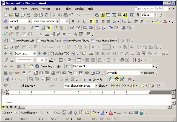
First, it’s tempting to add features that are easy to add, but after a point these will have a negative affect on the experience. Look at Microsoft Word.

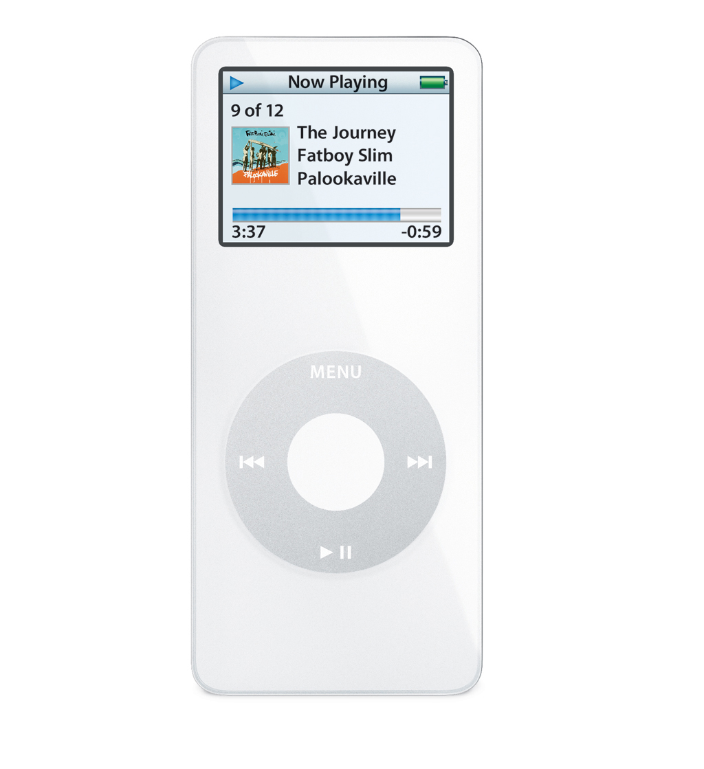
Then look at the iPod.

Keeping the interface simple makes it easy to use.
Second, recognise the temptation for programmers to model a user interface based on the underlying software – and then try to avoid it. Try to design the UI based solely on the user’s goals, and then manipulate the software to suit. Not always entirely possible, never easy, but always worth trying.
And this is the reason why design should take place at the same time as development where possible. If it’s left too late, the later one leaves it, the harder it is to change the software.
That said, it’s never too late to try and apply good design principles to a product. TiddlyWiki is a great case in point; both the website and the product have evolved in a myriad of useful directions, but as a result they’ve become quite complicated for the novice, non-technical user to understand.
TiddlyWiki is not Osmosoft‘s or BT‘s product. It belongs to the open source community (well, legally, the code is being held in trust by the not-for-profit foundation UnaMesa. But you get my point). My plan is to enlist help to come up with ideas about how TiddlyWiki can be improved, and post these on the TiddlyWiki forum for comment. Watch this / that space for more on this subject.